
A while back I had a question from a blog-fan about how I did the layout for my “Geek-Chic” sign. Graphic design is my day-job so I always use the Adobe Creative suite to create text layouts. InDesign (and sometimes Illustrator) are the appropriate programs for text layout but for a quick (and Free!) text layout I’m going to show you how to do it in Word. I know you’re thinking this seems impossible but I promise it will work. If you are creating a photo or artwork based layout, I suggest you use PicMonkey. (Here’s a PicMonkey tutorial from last year.)
To be honest, this is not a very smooth, easy way to create a large, text layout and I highly suggest investing in a short subscription to the Creative Cloud if you are planning to begin creating multiple projects but for a 1 time, Free, option, this will work. (As you move along, select each pic for a larger size.)
- Open a new Word.doc and select the “Page Layout” tab
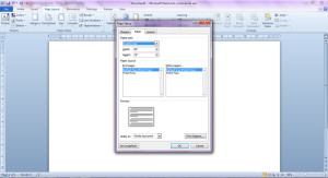
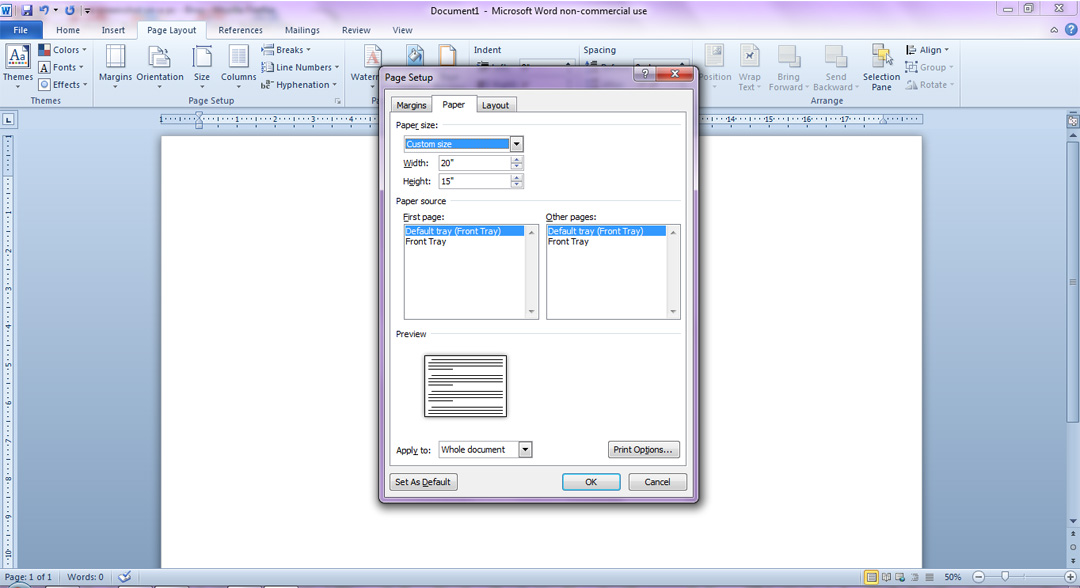
- In the pop-up window you’ll select the “Paper” tab (it should come up automatically) and under “Paper Size” scroll down and select: “Custom size”. Word won’t let you set up your layout to be larger than 22″ on each side so I set mine up to be 15″ x 20″ so that it will up-size to scale. (Later we’ll increase the final dimensions, for print.) A message will pop up asking to “Fix” the margins. You’ll want to select the “Ignore” option.
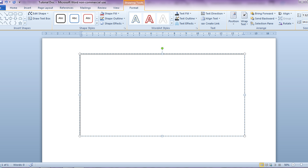
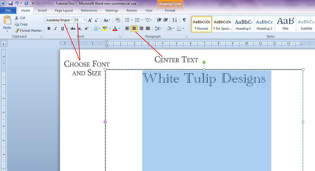
- Select the “Insert” tab and then the “Text Box” drop down menu then the “Draw Text Box” option at the bottom of the list. I will be leaving my box outline for the tutorial but you’ll want to select the “Shape Outline” drop down under the “Drawing Tools” tab and then select the “No Outline” option.
- Your curser will become a plus sign (+). Drag from the upper left to the lower right to create a large rectangle. When you release, your curse will begin blinking inside.

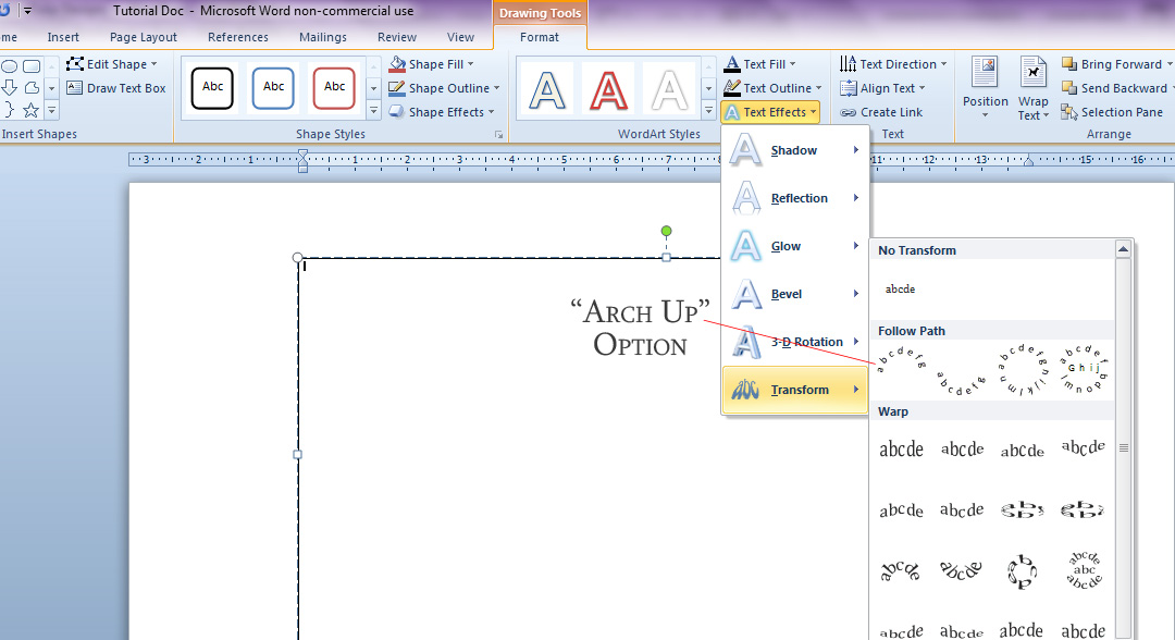
- Select the “Text Effects” drop down menu. Then select the “Transform” option;
- You may want to play around with the different text effects to see what works best for your project but for this tutorial we’re going to select the “Follow Path” - “Arch Up” option.

- Type in your first line of text. Now go back and highlight the text. Select the “Home” tab, center your curser, choose your font (I’m using Academy Engraved) and increase the pt. size to 150 (you can highlight the number shown and input whatever number you like.)
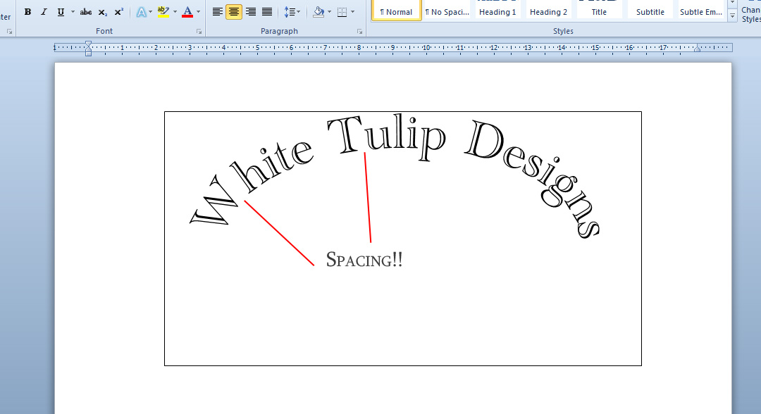
- Select the area outside of the box and . . . Ta Da! You have an arched line of text. But wait, now there’s a bit of a spacing issue, right? (Depending on your text and font choice, you may not have an issue but I want to show you how to fix it, just in case.)
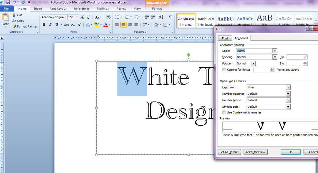
- Highlight the letter before the gap, right click your mouse, and select “Font” from the drop down menu and choose the “Advanced” tab.
- Select the “Kerning for Fonts” box, change the “Spacing” option to “Condensed”, and change the number to 5. You may need to adjust that up and down until you get you letters just where you want them.
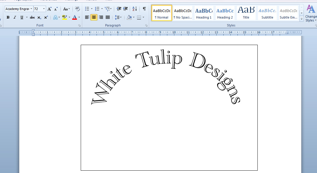
- You can use the handles on all side of the box to adjust the arch and make it wider, tighter, etc. as well.
- Get your file ready for print! Select the “File” tab and the “Save As” option. In the “Save As Type” drop down menu choose the PDF option and save. We’re not done yet, so select the option to open after saving.
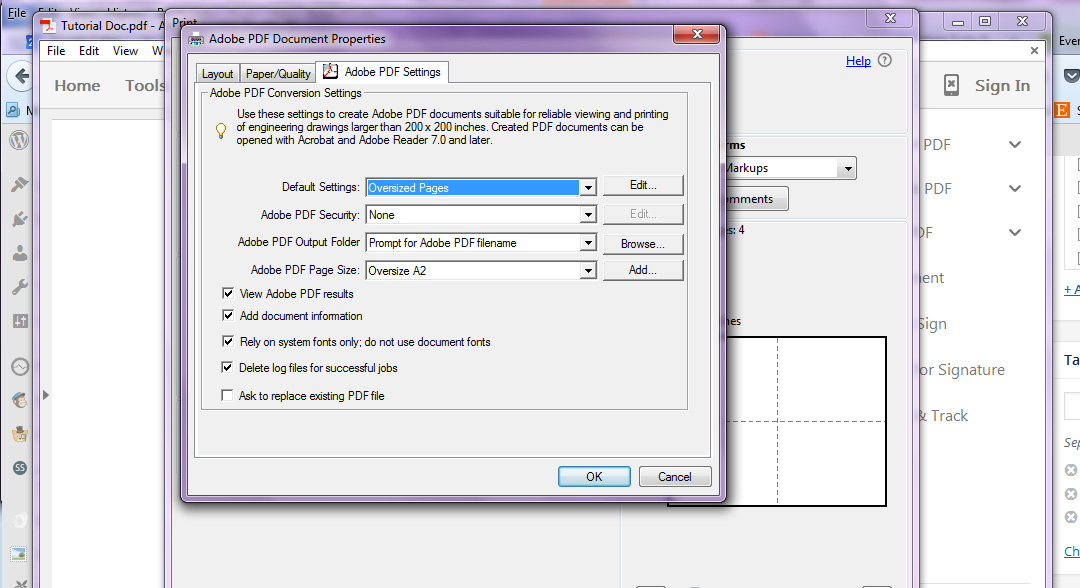
- Choose: the Print option, select Adobe PDF from the Printer options, and select the “Properties” button. Input the appropriate page size or choose to input a custom one.
- Now, you can use the “Custom Scale” to up size your text. You won’t be able to get it too much larger but you can play with it to get a size that will work for your project.
- Click “Print” to save your new PDF. You can now take your up sized PDF to a big-box print (like Staples or Kinkos) to get a large format print. Ask for an engineering print for a much cheaper option. They are black and white and the paper is thin and easy to work with for tracing and other projects.
I really hope this helps in creating your sign layouts!
Do you have a questions about any of my projects, that I can go a little more into detail with? Don’t hesitate to ask!
Have a lovely afternoon!


Jennifer (White Tulip Designs)